The Role of Typography in Website Design: Turning Visitors into Customers
Typography is often overlooked in website design, but it plays a critical role in how visitors interact with and perceive your site, generally on a subconscious level. By creating a clear visual hierarchy, typography can make it easier for visitors to find what they’re looking for, while also establishing a tone and atmosphere that invites connection.
The strategic use of typography can help increase engagement levels and turn your visitors into customers. In this article, we’ll look at the important role typography plays in website design and how you can use it intentionally to create an engaging user experience for your visitors.
Additionally we’ll discuss what to keep in mind when selecting the right fonts for your site and look at examples of successful websites that make clever use of typefaces.
Let’s get started!
What is Typography and how does it impact website design?
Typography is the art and technique of arranging type to make written language legible, readable and appealing. It involves the selection of typefaces, sizes, spacing and colors - all elements that can have a dramatic impact on how visitors interact with your website. Through careful use of typography, you can attract customers to your brand, encourage more engagement, and even influence a purchase.
Poor typography can do the opposite, turning people off to your brand because of a confusing, unprofessional, and unappealing user experience.

The impact of typography on a reader
The visual hierarchies typography creates helps guide readers through the page and focus their attention on specific elements. By choosing the right fonts, you can influence a reader’s mood and engagement level, captivating them with an attractive design.
Did you know the fonts you choose can determine the emotions of your customers? It’s true!
Different fonts and font combinations evoke different sentiments and can be used to communicate messages more effectively than words alone. For instance, if you want your visitors to feel comfortable and relaxed, then using a smooth, friendly typeface will achieve this goal far better than simply telling them to “relax”. (Does telling someone to "relax" ever work anyway?!)

On the other hand, if you’re trying to build trust or emphasize an important call-to-action; straight-lined, clear-cut typefaces will help grab the reader’s attention and “get to the point”.
With the right font choices, your message can be communicated more clearly and influence a reader’s emotions and therefore, their actions. By taking a little extra time, you can ensure that your content is communicated with the utmost effectiveness and visitors stay engaged throughout their entire experience.
How fonts can be used to capture visitors' attention
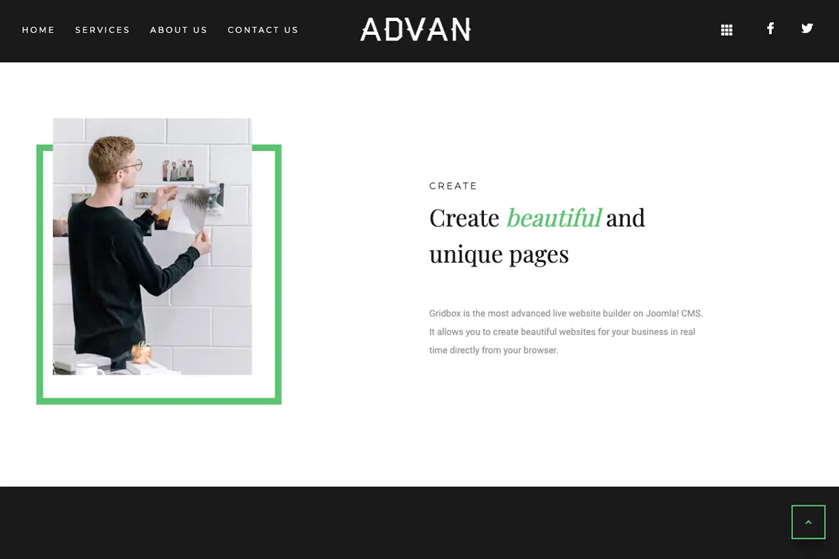
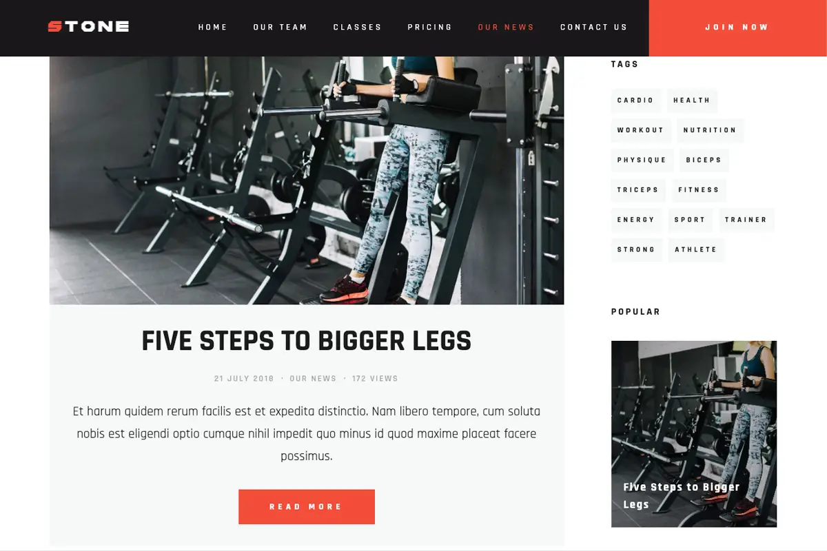
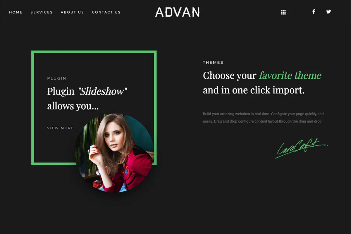
Fonts are underrated, but powerful tools when it comes to capturing visitor’s attention and their styling can be used as a way of emphasizing key messages or calls-to-action. For example, bold fonts can be used to draw in the reader’s eye and make a particular element stand out. Italics help emphasize words or phrases that you want readers to remember, and highlighting words with the use of colors different than your default text color creates a memorable effect as well.
Different typefaces exude different tones, from modern and minimalistic to classic and formal, which makes fonts a fun way of adding personality to text. Using too many, however, can have an adverse effect and make the page look cluttered, taking away from your main message. It’s best to limit yourself to two or three font combinations throughout the website.

Always keep in mind legibility and readability. You want visitors to understand what they’re reading, almost intuitively and without too much effort or strain. Utilize appropriate header tags (H1, H2, H3, etc.) and their corresponding font sizes for page headings and smaller sizes for body copy so on-page hierarchy flows naturally. Stay consistent throughout your site by using the same sizes for your body copy and each heading tag on every page.
Visitors will find your website easy to follow and engaging when you style your fonts well. Attractive and effective typography can be a determining factor in whether or not they take action on your website and/or make a purchase. Don't make your typography and font choices an afterthought!
Examples of Effective Typography on Websites
You don’t have to look far for good examples of well-crafted typography. Apple, Nike, and AirBnB are three big brands that utilize different fonts and font styles throughout their websites to create an engaging user experience.
Here’s the key: Effective typography makes things easy. Visitors can easily find what they’re looking for, they can clearly see what is being offered, and they can easily navigate to buy your product or make a reservation.
You know it’s good typography when you don’t even notice it. Distinctive fonts draw attention to certain elements and varying font styles enhance readability, making for a seamless and professional look.
If you don’t know where to begin, start by looking at the website you visit the most and take note of how they effectively use typography and follow suit. There’s no need to recreate the wheel, just remember to stay true to your brand and your messaging. With strategic selection and placement of fonts, you can create an attractive and user-friendly website that encourages engagement and boosts conversions.
What makes a good typography choice for a website?
When it comes to selecting the right typefaces for your website, there are a few key considerations that you should bear in mind. For one, what is the purpose of your site – is it informational or selling a product/service? Depending on the nature of your website, you’ll need to pick fonts that appropriately fit the tone and style. If you’re running an e-commerce store, a modern sans serif font will be more appropriate than an overly ornate serif font. If you're running an attorney's office or CPA firm, you can lean toward a more formal font style, including those with serifs. (Serifs are the little “feet” on the edges of letters. Think Times New Roman.)
Also, make sure that the fonts you choose match the overall design aesthetic of your website and brand. It’s important your typography fits with the other elements on the page and enhances rather than distracts from them.

If you have questions about how to best choose font families and select the proper typefaces to match your branding and enhance your website, we'd love to help!
Best Practices for Using Typography in Web Design
When it comes to using typography in web design, here are some key best practices you should keep in mind.
First, choose a few core font families. Select primary and secondary font families that go well together. You can have a third font, but do not use more than three. This starts detracting from your messaging and creates a messy look. Generally you’ll use one font for all of your page headers and one for your body copy.
Second, stick with them throughout your website. This creates a consistent look and feel that will help visitors easily identify content on your site.
Consider readability when selecting fonts. Use easy-to-read typefaces at a comfortable size for optimal results. The harder readers have to work to understand and follow your content on your webpage, the quicker they are to give up and shop somewhere else.
Finally, ensure that your text is properly spaced and aligned for a polished look. Spacing and alignment plays into readability but also reflects on your level of expertise. Poorly spaced text makes it look like you don't know what you're doing.

Implement these simple guidelines and your website’s typography will create seamless user experience that encourages visitors to engage with your brand and turns them into customers.
Turning Visitors into Customers with Strategic Use of Typography
By leveraging typography to create a visual hierarchy and establish the right tone, you make it easier for visitors to connect with your brand and navigate your website to find what they’re looking for. All of this increases engagement levels and encourages customers to take action.
With the right combination of typefaces, sizes, spacing and colors, you’ll build a site that’s professional and polished, designed to draw people in and drive conversions.
So take the time to think about how typography can be used strategically in web design, and you’ll find yourself well on your way to building a website that turns visitors into loyal customers.
To get an outside view about how to improve your typography and web design, reach out. Our team is here to help.


